Reclining Figure In Tone
Here, I have chosen to work with sticks and pencils of soft pastel to allow me to focus on tone as these have worked well for me in previous exercises on tone. I am using a large support (65 by 50cm) of blue pastel paper and am restricting my colour palate so I really have to think about tonal contrast.
I started by drawing a couple of quick sketches to decide on the best composition.

My model is positioned in a way that allowed me to look at perspective and foreshortening with her feet closer to me. There was a strong ,natural light coming from the window to the left into a room which is naturally quite dark, which gave me reasonable contrasts.

The pastels allowed me to make mistakes as they were easily rubbed out but I tried not to smudge the marks as I wanted some textural marks. I soon realised that my darkest blue wouldn’t be dark enough, so I tentatively introduced a red for the darkest tones.
I was working with an easel and found myself holding the chalk pencils as if they were a paint brush which helped free up my mark making.

I am pleased with the proportions, the tonal contrasts and the likeness I have achieved and I like the introduction of the red as this gives a bit of contrast to an otherwise too soft an image. If I were to do it again I might choose to work with colours different from the background. As a composition I am happy apart from the head being too near the top of the page. Maybe I could have made it more interesting by zooming in.
Seated figure with line
This time I struggled to think about what medium to use working with line on an A1 support. After looking at other artists work, particularly Henry Moore, I decided to use a range of artists pens, biros and graphite pencils.
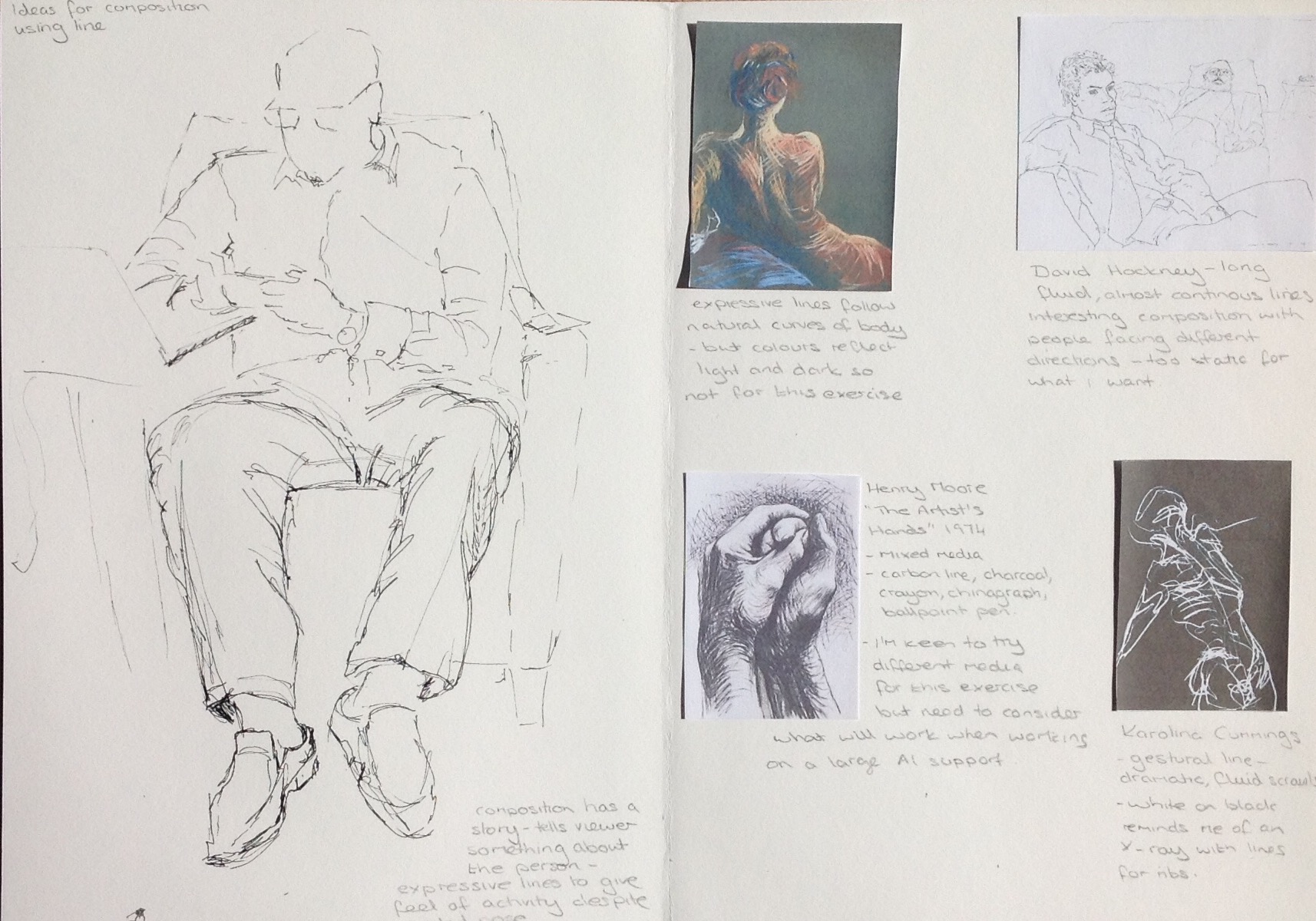

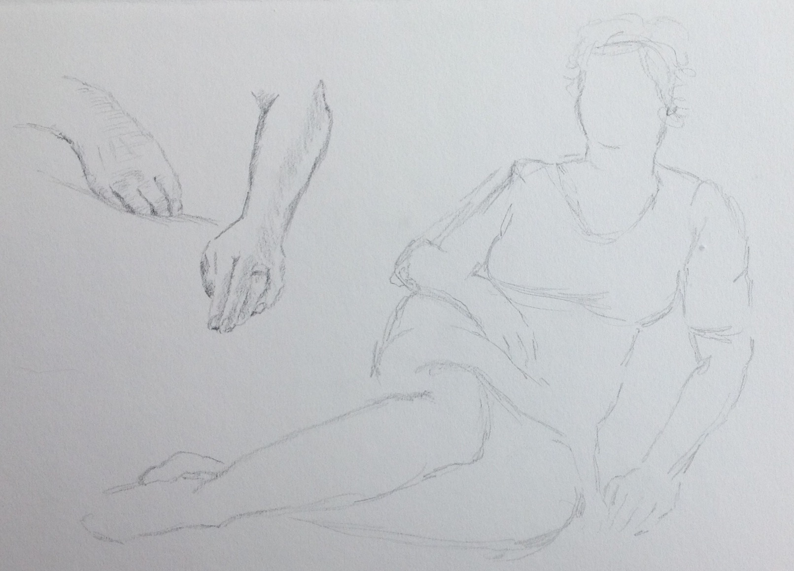
Thinking about the composition I wanted to capture something of the sitters personality and managed to capture him suited and booted and squeezing in a bit of work before catching his train. He is busy tapping into various gadgets a look of concentration on his face. I had struggled with how to get the position of his hands so had a practice with different types of mark making.
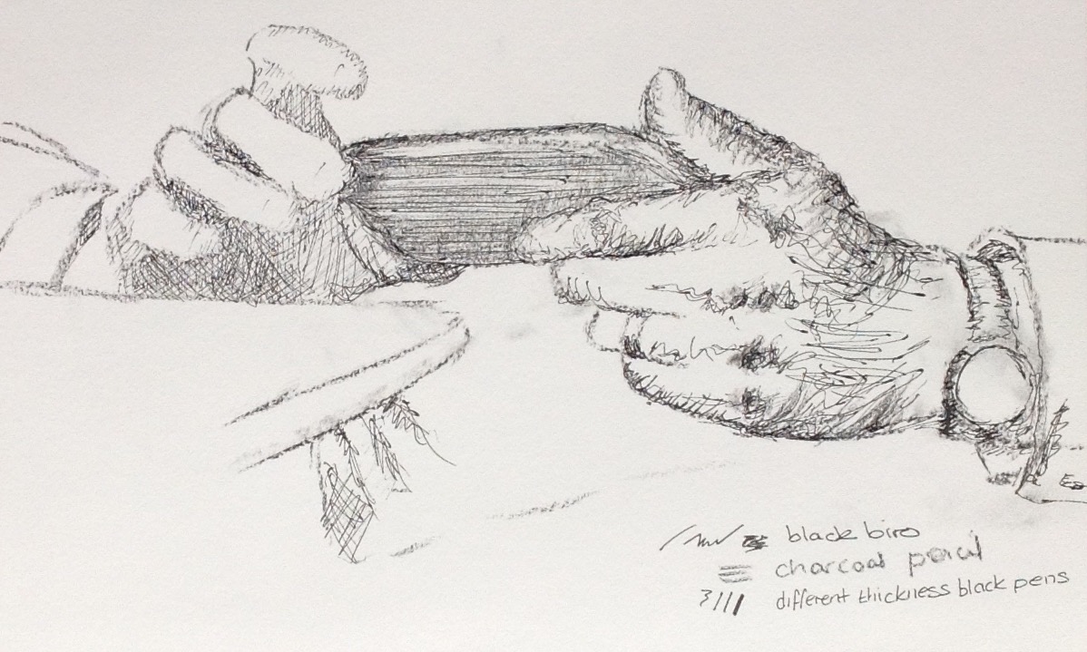
Rather than a few hours this took me several days, so although I started drawing from life I had to continue with a photo. I found it so much harder getting the proportions right while working on such a large scale. Then came my indecision regarding what sort of lines to make which has resulted in a bit of a mixture of styles, but I’m not sure if that matters as I rather like the end result. I am pleased that I have managed to describe the folds and contours of the shirt without using tone. I think that I have struggled finding the right marks to use to describe the hands .

Portrait using line and tone
I started by looking at other artists work that I found interesting and expressive. I knew that I wanted to keep it monotone and use interesting marks and decided to try a couple of ideas with interesting cropping.

My model always looks quite confrontational, even though he isn’t at all. I wanted to try and capture his intense stare and decided on having him look directly at the viewer but with his head angled away. I decided to work with water-soluble ink with a dip pen and brush. I have used a square support which I think works quite well.
 Ref: http://www.studentartguide.com

Wonderful drawings! ALL of them! Congratulations on a fabulous assignment! You have a really delicate and expressive touch!
LikeLike
Thank you Susan, it is a relief to have them finished..now I can worry about part 5!
LikeLike
Great work. I’ve just finished this assignment myself and really struggled. I think the portrait is very fine – is it on A1? The squiggly pen marks work really well. The sitting portrait also has some wonderful mark making on it and the proportions of all are excellent. I wouldn’t have said the head is too near the top. I agree its such a relief to be getting on to assignment 5- are you going for july assessment? I am and I’ve left things pretty late!
LikeLike
Thank you so much. I have just had a look at your fantastic drawings. They are all so interesting. The line drawing has worked really well and I can’t stop looking at it. There is so much to draw your eye and maybe this is because of the techniques you have used, but the other drawings are also good. I think the perspective in your reclining figure is quite successful with the dramatic tones.
I am holding off making a decision about part 5 until I receive feedback from my tutor as I do not have a strong inclination in one direction as yet. I guess I could be ready for submission in July….scary! What about you?
LikeLike