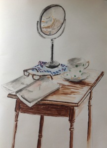
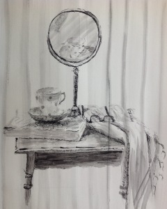
Part 5 – Reflections on conversation with tutor and review of report.

Areas that worked well:

  • Drawings working as a sequence or hidden narrative – bedroom watercolour
  • Interesting compositions with different viewpoints

Thinking about both these points I decided to work on two further  A 4 drawings to accompany the A 3 pencil drawing of the lounge to see how the different perspectives and compositions of the same subject, added to the narrative.

See below:

I like how these suggest a movement of time and changing of view from inside looking out to outside looking in. I think they could have worked better if they were all the same size and I used the same colour range.

Things to work on:

  • be bolder and more confident- substitute large brush for pencil
  • go smaller with finer tools – push pencil or silverpoint
  • consider different supports – e.g. gesso primer, unusual formats
  • use sketch books  more for preparatory drawings – experiment with media

After receiving my report I had a further conversation with my tutor. We had an interesting talk about size and how I could think about drawing with different extremes. How would one of my portraits look if enlarged further ? What impact would a more detailed drawing of an interior have if drawn on a postcard size support framed on an A1 sheet. What demands would it make on the viewer?

These are all considerations I will take with me on the next stage of my drawing journey.


Part 5 – Review of previous assignments

Form and Gesture

For assignment 1, I chose to make a few drawings of the same group of personal objects. I feel I was able to demonstrate my technical skills when working with chalk and pencils, however although less accurate, the ink and pen and brush drawing, have made for a more expressive and personal drawing.

I need to work on reaching a balance between a colder, more technically accurate drawing and a looser more expressive one. Using mirrors also gave opportunities for multiple viewpoints and I would like to explore working with reflections further.

Intimacy

Again technically this drawing of fruit and bowl is accurate but my one of pears is a more interesting composition. The apples and grapes is a safe and traditional arrangement and maybe a little boring. I have tried to experiment with mixed media and achieving a depth of colour which I feel I have achieved but the choice of media hasn’t allowed for the waxy texture of the apples or the luminosity of the grapes. Maybe water colour pencils or partial washes would have worked here.

In hindsight, I should have spent longer practicing different compositions and different ideas before committing to this piece and this might have given me the confidence to try something bolder. As suggested by my tutor, I could have tried different objects as seen in Lucien Freud’s ‘Still life with Aloe’. I also want to take forward ideas from my sketches on interiors, particularly the rocking chair composition where there are mini still life’s within a drawing and how they can create interest and a hidden narrative.

Expanse

This time I did experiment with different views, compositions and drawing media before committing to my final piece. I feel my observational skills are improving with regards to perspective and that I have created an interesting composition.

The thick charcoal stick and A1 support have encouraged me to be freer and more experimental in my mark making, such as erasure technique.

The washing line gives a sense of human presence and therefore some narrative and interest for the viewer but otherwise the drawing is just of a scene. This is something I want to explore further in future drawings…what to put in and what to take out.

The figure and head

I am pleased with my observational skills overall and feel I have achieved the correct proportions and foreshortening skills in my assignments.

Figure reclining in tone – after discussion with my tutor I realise that I didn’t choose the best colour for a support  for my chalk drawing and that a more neutral colour could have acted better as a mid tone and have given me better alternatives than red as a darker tone. Also the drawing looks lost against the strong blue.

Seated figure in line- Working on A1 requires a larger tool as the pen required a lot of work. I could try a brush or felt pen and try to use my whole body to make larger more expressive marks. Having said that, I really enjoyed working on this drawing and like the different patterns and textures of different fabrics.

Portrait- This drawing has more expressive marks but the background needs to be darker to accentuate the lighter tones and thereby creating more drama.

Of the artists I researched for this assignment, many of the figures and portraits were seen out of an environment or background scene. Similarly my drawings have little in the way of context the person being central. The figure in line maybe has some narrative in that he is dressed for the office and is working on his gadgets but if I had also placed him in an environment it would  have made for a more interesting drawing.

Tutor’s Report

Summary of Video tutorial: we discussed areas  to go for in part 5 – a more personally driven project approach. You wanted to continue working with the figure, and experiment with a greater variety of supports and drawing media and instruments as additional objective. I suggested you write up a proposal for now which you can email me, this will then get reworked into your project statement later on when you had a chance to revise your ideas. There are (optional) possibilities to implement close to home aspects to the figure, by including furniture, interiors or other domestic ‘stage settings’ for the figure.

Strengths of submission of part 4:

1. Sensitivity in mark making and use of line

2. Tackling large scale

3. Sketchbook work – freshness of mark making

Weaknesses of submission of part 4:

1. Up scaling of marks to larger scale

2. A laboured finish – freeing up gesture?

3. Use of supports (low quality papers can limit the results especially if working with wet and dry media) Although on a budget investing into some better papers would yield better results, especially if working with fugitive media (pastel/charcoal) to allow better integration of pigment into surface of paper. With wet media like ink again the potential to explore washes for immediate tone would be better explored in heavier papers with a watercolour finish. We discussed Bristol Card and Senellier cartridge 300gms weight as inexpensive alternatives to Hot Press heavy grade watercolour paper.

The nature of this part of the course leads to quite self-conscious results in many students, and as in previous assignments, the sense of having to finalise and conclude all what has been learned in the assignment can lead to a lack of freshness, or spontaneity and lack of risk taking.

Areas of strengths in previous projects:

• Landscape and perspective work was strong in sketchbook: you offered unusual perspectives and beautiful integration of clouds/ weather with rooftop drawings; your townscape drawings in sketchbook in particular where often very atmospheric.

• Portrait work in part 4 through less predictable formats out in part 4 and could form part of your project approach for part 5?

Choosing an option

This I found difficult as I have enjoyed all parts of this course so I am thinking of combining the ‘figure and face’ with ‘your immediate environment’. I have looked back at some of my sketches around the house  and they lack a sense of narrative. Also my figures from part 4 are very much the centre focus and are not placed within an environment. As previously mentioned I would like to explore reflections further and am thinking along the lines of an intimate bedroom scene with use of mirrors to add different perspectives and views. I would also like to think about the figure as part of the scene rather than being central to it.


Assignment 4

Reclining Figure In Tone

Here, I have chosen to work with sticks and pencils of soft pastel to allow me to focus on tone as these have worked well for me in previous exercises on tone. I am using a large support (65 by 50cm) of blue pastel paper and am restricting my colour palate so I really have to think about tonal contrast.

I started by drawing a couple of quick sketches to decide on the best composition.

My model is positioned in a way that allowed me to look at perspective and foreshortening with her feet closer to me. There was a strong ,natural light coming from the window to the left into a room which is naturally quite dark, which gave me reasonable contrasts.

The pastels allowed me to make mistakes as they were easily rubbed out but I tried not to smudge the marks as I wanted some textural marks. I soon realised that my darkest blue wouldn’t be dark enough, so I tentatively introduced a red for the darkest tones.

I was working with an easel and found myself holding the chalk pencils as if they were a paint brush which helped free up my mark making.

I am pleased with the proportions, the tonal contrasts and the likeness I have achieved and I like the introduction of the red as this gives a bit of contrast to an otherwise too soft an image. If I were to do it again I might choose to work with colours different from the background. As a composition I am happy apart from the head being too near the top of the page. Maybe I could have made it more interesting by zooming in.

Seated figure with line

This time I struggled to think about what medium to use working with line on an A1 support. After looking at other artists work, particularly Henry Moore, I decided to use a range of artists pens, biros and graphite pencils.

Thinking about the composition I wanted to capture something of the sitters personality and managed to capture him suited and booted and squeezing in a bit of work before catching his train. He is busy tapping into various gadgets a look of concentration on his face. I had struggled with how to get the position of his hands so had a practice with different types of mark making.

Rather than a few hours this took me  several days, so although I started drawing from life I had to continue with a photo. I found it so much harder getting the proportions right while working on such a large scale. Then came my indecision regarding what sort of lines to make which has resulted in a bit of a mixture of styles, but I’m not sure if that matters as I rather like the end result. I am pleased that I have managed to describe the folds and contours of the shirt without using tone. I think that I have struggled finding the right marks to use to describe the hands .


Portrait using line and tone

I started by looking at other artists work that I found interesting and expressive. I knew that I wanted to keep it monotone and use interesting marks and decided to try a couple of ideas with interesting cropping.

My model always looks quite confrontational, even though he isn’t at all. I wanted to try and capture his intense stare and decided on having him look directly at the viewer but with his head angled away. I decided to work with water-soluble ink with a dip pen and brush. I have used a square support which I think works quite well.

Ref: http://www.studentartguide.com


Assignment two

I decided to work on a still life for my final piece, partly because I had been drawn to the bowl of fruit on the dining room sketches but also because I had enjoyed using strong colours in my monochrome exercise of pears. I wanted to develop this further with a drawing that focuses on two main colour groups, red and green. This also provided me with the opportunity to use pencil again but I wanted a stronger colour than I had produced in exercise two- still life in tone. After some preliminary drawings and practise using different media I decided to also use oil pastels and maybe chalks too to give added depth and texture. Then I used my view finder to plan how far to ‘crop’ into the picture in landscape format. I decided to put down a wash of pale green in acrylic paint, hoping it would give a green base of colour to all the forms.

image

Preview Of My Work Using Assessment Criteria

1. Demonstration of technical and visual skills

I have tried to use a mixture of mediums, oil pastels, pencils and chalk to capture the strong colours of the fruit and bowl and their different textures. The acrylic wash has added green undertones to the fruit as it cuts through the thinner applications of colour. As a composition I chose to zoom in on the bowl from slightly above as if the viewer could reach out and help themselves.  I could have added interest by choosing fruit that had less round/oval forms to add more variation. Although I consciously chose not to have a background the composition may have had more interest if the colour of the background had more contrast.

2. Quality of outcome

Although the pencils and pastels have given strong colours and interesting marks and smudges, I have not achieved the waxy, shine of the apples skin or the luminosity of the grapes that I had hoped for. Maybe a different medium would have worked better, or maybe it is my inexperience with using pastels. I feel I have achieved good tonal contrast and am learning to work on a larger scale.

3. Demonstration of creativity

For me this is to do with expression. I am aware that I am so absorbed with translating the image in front of me that I become anxious and do not leave myself the freedom to experiment and play. Especially as this is a final assessment piece.

I would like my lines and marks to be more fluid and looser,to portray the softness of the grapes against the firmer apples, but I am not yet sure how to achieve this. I am pleased that I have experimented with a new medium and worked at layering different media.

If I had more time I should have spent longer on my preliminary sketches which may have given me the confidence to try something bolder.

4. Context

Having looked at the drawings of Graham Little,in pencil and the strength of colour he had achieved it encouraged me to have another try with pencil, I also was interested in how he had used acrylics to create the effect of the woman looking through a window perhaps. I decided to try an acrylic wash as a base in this instance but would like to try it the other way around another time.

When looking at rooms around my house, I was struck by the neutral and muted colours  which I have chosen I guess because these are natures colours and those that give me a sense of peace. However, for this piece I wanted to explore vibrant colour, hence my subject choice of apples and grapes as a still life instead of ‘around the house’.

Ref : Hoptman, L, ed. (2002). Drawing Now: Eight Propositions . Museum of Modern Art: New York. p158


Assignment one

For this assignment I have decided to make a few drawings in different media and composition before deciding on my final piece. I started with some pencil sketches to familiarise myself with the objects and play with the composition. As the mirror is a lot taller it made it difficult to balance the composition. There are lots of reflective surfaces and different textures which should make the final drawings interesting.

imageimageimage

Watercolour pens

image


I used some watercolour pens so that I could achieve soft and hard lines. I am confused how to approach this piece in terms of expression. Some of my objects , like the tea cup, have good associations as it belonged to someone dear to me, but the mirror and glasses are objects of dependency . How do I reflect that in my drawing? Next time I need to spend more time on the scarf and find a better source of light to create more shadows. I am pleased with the way the light falls on the objects and I like the composition. I would like to try using mixed media too.

Soft chalk and pencils

image

I am am happier with composition in that the focus is more on my chosen objects than the table and it fills the page better. The chalks soften the objects and the pencils allow me to create some detail. I used a mixture of marks, smudging and rubbing to get different affects for different objects.

As I have been working I have been reflecting on how the objects all relate to loss for me. The cup and saucer from a deceased love one, the glasses and mirror a result of  ageing and my deteriorating vision. Although I am pleased with the accuracy of the composition I would like to focus more on creating an atmosphere related to these objects.

Ink with dip pen and brush

image

I feel this drawing best conveys the feelings of loss and sadness associated with the objects, hence the closed book. The transparent nature of the ink suggests a lack of permanence and the scratchy marks reflect my anxiety surrounding these objects. The vertical marks  of the window blinds help add to the atmosphere and the absence of lines soften and create delicacy to objects like the China cup. I would still like to try a fourth drawing as again the arrangement and light source could allow for better shadows and reflections.

Pencil

image

I like this composition as it feels intimate as if I could reach out and pick up my glasses and carry on reading my book. However, I did find the perspective challenging and there were many attempts and rubbings out. Looking at it now I can see a few technical errors.

I am pleased with the shadows and reflections which the bright sunlight gave, but as it took me many hours and of course the shadows constantly changed so I had to put the shadows in early.

Overall, the shapes are believable and I am pleased with the tone, light and shadows. The angles are interesting, especially in the mirrors image. However, in the previous ink drawing I  think I have used more experimental and expressive marks and have created more atmosphere.